|
|
Post by ` everly ! on Dec 12, 2010 11:26:36 GMT -8
skills assessment: pideaux [/i][/font][/size][/right]
Okay, so as I mentioned before, if you could post that image here [or any other recent image], then i'll assess your strengths and weaknesses by critiquing the image and pointing out the spots that we can work on.
i'll also include tips and tricks on how to make the image better, and we'll work on each step individually.
sound good ?
|
|
|
|
Post by [Pideaux] on Dec 12, 2010 11:40:56 GMT -8
|
|
|
|
Post by ` everly ! on Dec 12, 2010 12:33:37 GMT -8
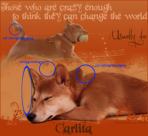
critique: carlita table head [/i][/font][/size][/right]

[•] okay, so we'll start by going over cutting and smudging of fur ;;
i assume that you're using the eraser tool, so here's how to improve with that.
first, make sure that when dealing with animals and fur, you use a soft round brush as opposed to a hard round brush.
next, you don't always have to follow the outline [of a tail, head, etc.] of the original image. if it looks weird [like the tail in this header], then erase more of it to make it look natural.
the same thing goes for the neck area of the bottom image. you need to be the judge and erase as much or as little of the dog to make it look natural.
it's also a good idea to smudge animal fur, but it's by no means a necessity. i myself don't do it very often, but in cases where you are cutting out an animal and placing it on a different background, you probably should.
my advice for smudging is to first choose a brush similar to this brush.
next, zoom in as much as you want [the more, the better], and start by grabbing just a little bit of fur and pulling/pushing outward. try doing this with as little fur at a time as possible, otherwise you get a spiky look. you can also push/pull at an angle for a better effect.
now, if we move down towards the bottom image, you'll see that you have left behind some of the black background. you need to always make sure that your subject is completely severed from the background. otherwise they become noticeable and it looks non-professional. it sticks out in this case because you left some black background on an orange background. so just always make sure of that.
[•] okay, so now that we've covered mechanics of the image, let's move on to some general presentation stuff ;;
text - a tip for text is to always try and have your sub-text [those who are crazy enough...] homogeneous. basically, try and keep it all the same colour, font, size, etc. however, i understand that sometimes it's a good idea to change the last few words or so for effect. i do that too. but what i still stick to, is colour. colour is perhaps the most important because it implies that the last few words or so that are changed, are still connected to the rest of the main text. the problem here isn't the font, size, etc. the different hue suggests that 'usually do' isn't part of the sub-text. but again, this isn't a must; just a general rule of thumb.
overall, this is a pleasing header. the positioning of both canine images is smart and gives off a professional feel. also, if you had the top image at a lower opacity, it might have a better effect, but it's still excellent as is.
the lighter brown brushes you used to separate the top half from the bottom is also lovely, seeing as you ended the bottom of the image with the original orange.
good job !
(:
|
|
|
|
Post by [Pideaux] on Dec 12, 2010 15:44:04 GMT -8
That's amazing <3 - I'm going to work on the fur cutting and smudging a bit tonight and tomorrow and post a image for you to see if I'm doing it right. XD - And I agree with you about the text. I didn't know how else to separate the 'usually do' from the main portion because the person wanted it to stand out a little more than the other text. I didn't even notice that I had missed those smaller spots outside of the drop shadow /shot. ^.^
|
|
|
|
Post by ` everly ! on Dec 12, 2010 16:30:40 GMT -8
actually, i'd like you to hold off on practicing any of the skills yet and posting them. i have some sample images that i'd specifically like to see you practice on.
plus, i think it would be best if i first critiqued all of the images you gave me, and then we start 'lessons'. cutting and smudging fur will be one of the lessons, so don't worry.
but by all means you're free to practice freely.
and as for the text, i have some tricks that i use, and i'll share those with you as well, in time.
(:
|
|
|
|
Post by [Pideaux] on Dec 12, 2010 17:49:39 GMT -8
So glad I came here to re-read this now. I believe I have the correct brush for the fur, however must not be doing the correct motions.  - I can wait. ^.^ |
|
|
|
Post by ` everly ! on Dec 15, 2010 17:32:00 GMT -8
Pideaux !
i'm so sorry that i haven't been able to post anymore critiques.
i've just been incredibly busy with school but i promise i will pick that all up during the break.
please bear with me !
(:
[/blockquote] |
|
|
|
Post by [Pideaux] on Dec 17, 2010 16:52:27 GMT -8
That's perfectly fine. X3 - I've been practicing and although I'm sure it's completely obvious that I'm no expert, I was quite giddy over what I did. X3 I'm patient, don't worry about it!
|
|
|
|
Post by ` everly ! on Dec 20, 2010 20:38:05 GMT -8
ohmygosh, i am so horrible, Pideaux !
my internet is been down for the past few days, so i haven't been able to get on.
:/
but i promise that on wednesday, the rest of your critiques will be posted, and i'll post the first lesson.
(:
|
|
|
|
Post by ` everly ! on Dec 22, 2010 18:49:51 GMT -8
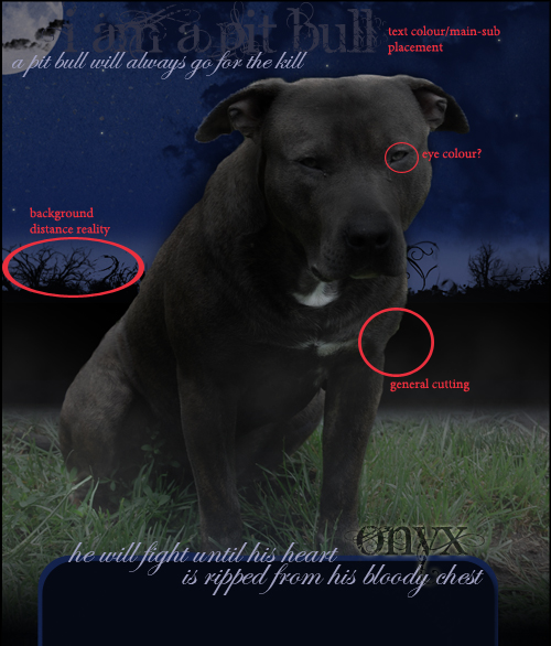
critique: onyx header [/i][/font][/size][/right]

[•] so we've already covered the issue with fur cutting/smudging, but i still want to point out that it's one of the weaker points in this piece ;;
now, let's move on to colour which i think is a bigger issue in this piece than the other one.
i can see that you needed the image of the dog to be black/grey. i'm assuming that you used the sponge tool and desaturated the image. that's completely fine when you're trying to drain the colour of an image. however, the problem that often arises when using this tool is that it completely drains the eye colour as well. now, in this case, i'm not sure what the requester wanted for the eyes- grey [as they are], or not specified.
so for now, let's just say that they didn't specify. in any case, you should always have some colour to the eye so that it doesn't look weird. there are a couple methods to ensure that this happens.
first, you can make sure to sponge and desaturate every pixel of the image except for the eyes. this method is usually preferable so that you don't lose any natural colour from the image, which is a plus.
i know that that is tedious and at times hard to do, so in cases like that, use the second method.
secondly, you can do what i believe you have done here and completely desaturate the image. once you're done, you should change the eye colour.
to do this, first, select the Polygonal Lasso Tool [by clicking and holding down on the 'Lasso Tool' icon]. at this point, feel free to zoom in as much as you want. then, choose a starting point on the outside of the eye. after you've clicked somewhere on the outside of the eye, continue clicking on points around the eye until you've completely encircled it. once you've joined all your lasso points, the eye should be selected with the moving dashed line. it should look something like this. next, either hit Ctrl+U or go Image > Adjustments > Hue/Saturation. this window should pop up. you should familiarize yourself with the following terms before using these options:
hue: the colour/shade
saturation: the prominence/solidity/strength of the hue
so, to change the eye colour, just play around with the three sliders. you should also notice that on the bottom right area of the window, there are two boxes titled 'Colorize' and 'Preview'. now, the 'Preview' box should always be check marked, so that you can see the results of your modifications without having to click 'OK'. what 'Colorize' does is changes the hue of the selected section of the image to 'normal, web colours.' so if the eye is a mixture of yellows, greens and whites, then when you're changing the hue, it's going to look weird because the greens will turn bluish while the yellows turn greenish, or whatever. by 'Colorizing' the eye, the eye becomes one colour and looks better when you change the hue. however, it's completely up to you as to whether or not you do it.
once you've achieved a colour you're complacent with, hit 'OK', and your eye colour has now been changed !
going back to this image you have done, i brought up the eyes because it would have looked better/more natural if you had changed the eye colour. a black dog with grey eyes is a horrible combination in general, as well.
[•] moving on to presentation of the image ;;
text -
remember to keep in mind the rules of font, colour, size and placement for main text & sub text.
background -- distance reality -
when you're taking an image, cutting it out, and sticking it onto a scene background [as you have done here], a key thing to remember is distance reality. all this is is sizing your cut-out image [the dog] perfectly so that it doesn't look weird against a scene. for example, if the background components [grass, plants, etc.] are small, you will assume that they are farther away. it is your job to size your main object [the dog] properly so that it seems either closer to you, or closer to the scene components [grass, plants, etc.].
in this case, it would've been flawless in this area if there weren't those black brushes in the background creating some extra scenery. once you've added those, the distance reality is messed up. especially so, since the extras are plain black. if they were actual trees or whatever, it might have been able to work with some minor re-sizing of the dog.
this area is just something you need to eye ball. again, the point of it is to make the image look like one, realistic piece.
overall, this is an okay piece. the colours work together decently, but could be improved upon. the effect you used on the 'Onyx' text is great and would work even better with the image once you fix the other sub texts.
a great piece of work for someone who has been at this for as long as you have !
(:
[/blockquote] |
|
|
|
Post by ` everly ! on Dec 22, 2010 19:43:48 GMT -8
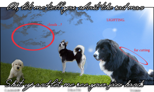
critique: torn siggy [/i][/font][/size][/right]

[•] once again, fur cutting/smudging is the main issue. other than that, the rest of the mechanics are fine.
:D
[•] the two main presentation issues with this piece are minor, but still things you should know ;;
clouds -
i will go ahead and assume that those are clouds. i'm not quite sure how you went about making them [brushes, painted, etc.]... in any case, i would recommend this website for downloading brushes. i know that they have some fantastic cloud brushes, and just great brushes in general.
the main issue with the clouds is the look... they don't look like realistic clouds. the lighting doesn't help, and i'll go over that in the next section.
basically, i'm sure that using different brushes will improve them a lot.
LIGHTING -
so i understand that you were trying to go for an opposite lighting effect where one side was dark [with the moon] and one side was lighter [with the sun]. something i'd recommend for making it look better is to use a black-white gradient.
first, create a new layer by hitting Ctrl+Shift+N or going Layer > New > Layer.
then, make sure that the top section of your window [the settings for the tool] look like this. then, click on the left-most edge of your image, and drag a horizontal line to the end of the image [you can play around with the length of the horizontal line]. once your gradient is placed, it should look like this. again, you should play around with the length of the horizontal line making it longer [off the image] or shorter until the half of the image which you want darker is for the most part, covered with the black and grey section of the gradient.
once you're happy with the gradient and its proportion, change the Layer Type to Multiply.
then, you can play around with the Opacity & Fill until you like how it is.
this will give you a better effect with lighting, thus, improving the appearance of the clouds as well.
you could also try playing with the colour of the clouds as well and testing to see what looks best.
all in all, this is my favourite of the three pieces, because it had the lest amount of flaws.
:P
but truly, this piece was the one that showed the highest skill level of the three; the transparent end spaces and the half way placed text was a unique addition to the signature, which is something that worked to your advantage in this case, adding some nice flare to the final image.
[/blockquote] |
|
|
|
Post by [Pideaux] on Dec 23, 2010 9:28:09 GMT -8
Okay. So I've been working a bit here and there on things you suggested... mainly smudging and fur editing. X3 - I know you would have liked me to wait for some kind of image provided by you to edit and then repost... howeeverrr... The owner of Kismet asked me to create a skin for them. So I've already started on it but it would probably be best to get your help and the like on it before I hand over the banner. The biggest peeve I have is the shadowing on the dog. I'm not quite sure how to edit it to fit the lighting on the image. I do realize that there is quite a bit more smudging that needs to be done along the fur like currently in place however. ^.^ i55.tinypic.com/33joieb.jpgPS - you're pretty amazing at this, everything is easy to understand and follow. I'm a decently quick learner so with your wonderffulll instructions, it will make things even easier. X3 |
|
|
|
Post by ` everly ! on Dec 23, 2010 12:22:00 GMT -8
okay, so i see that the main problem here is that the whole thing looks more like a painting than a photo... that right there causes some problems, but not as much as the next thing.
the other thing is that your background is a scene with the sky included. having the sky automatically limits your ability to modify lighting because once you do, it's not going to look realistic because the lighting is already set by the sky...
you can still work with this, however. i can see that you've made the shadow for the dog already. the only thing that i can think of to make the shadow better is to make it longer and extend it towards the shadowed tall grass on the right. then you can fade the shadow on that side and that might help. otherwise, there's not really much else you can do without changing the lighting, which i highly do not recommend.
i apologize for not being as much help here..
:/
i can give you a quick tutorial on fading the shadow, as well as other images in general if you'd like.
(:
|
|